Blood on Dot: Period Poverty App — UI/UX, Branding, Front End Programming
Work in progress
Software used: Figma, Adobe Illustrator, Node.js, Swift, JavaScript
Blood on Dot is an app where you can search for nonprofits, individual-led events, public showers, public restrooms, and other places with free period/period-related products. You can also add an event to be added to the map after details are verified about it to ensure safety. Additionally, there is short educational course on menstrual hygiene.
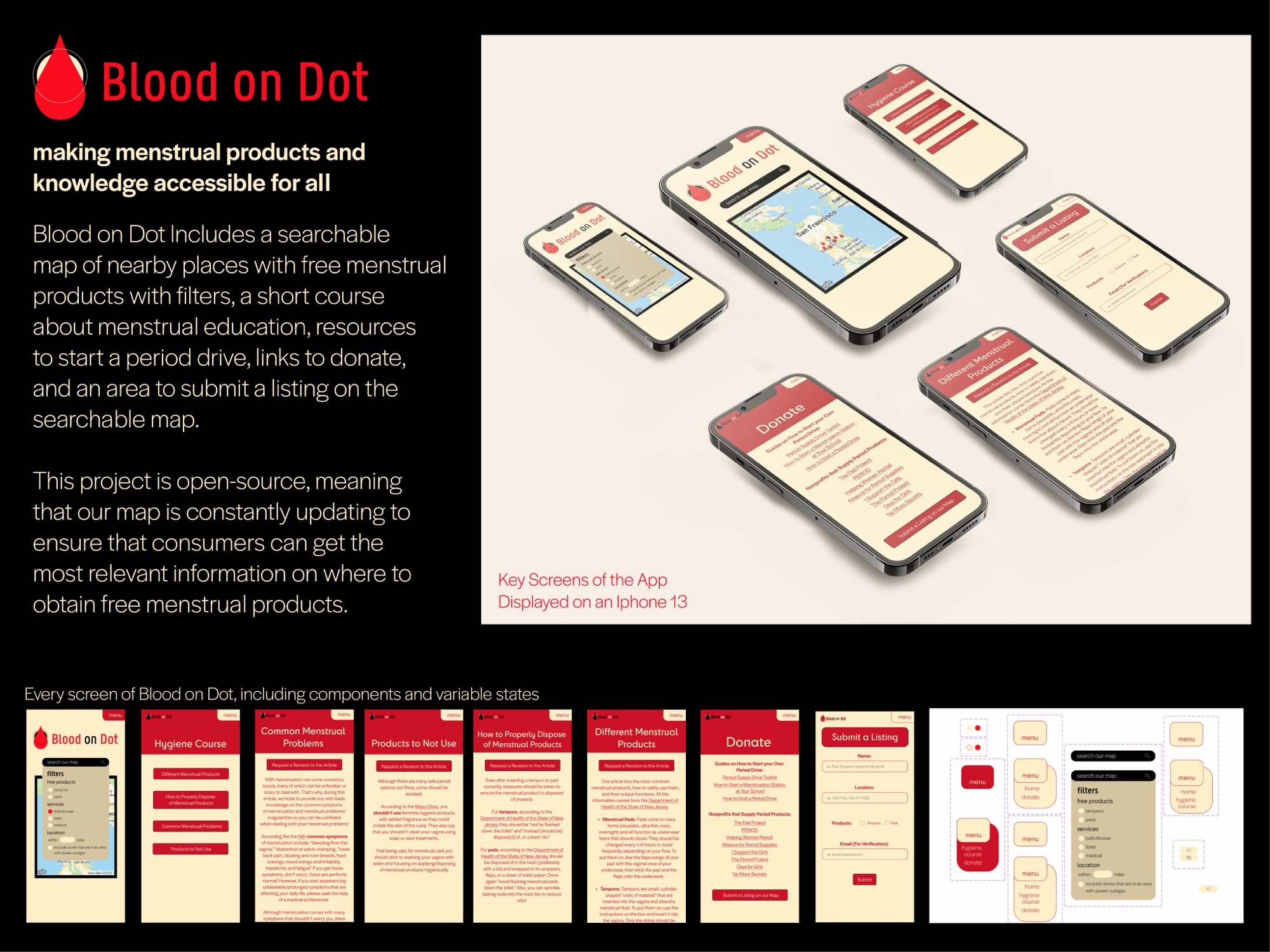
Figma File Link: https://www.figma.com/design/b9Qen8Je0CEkQHj1x0kXWG/bloodondot?node-id=0-1&p=f
Process
Branding
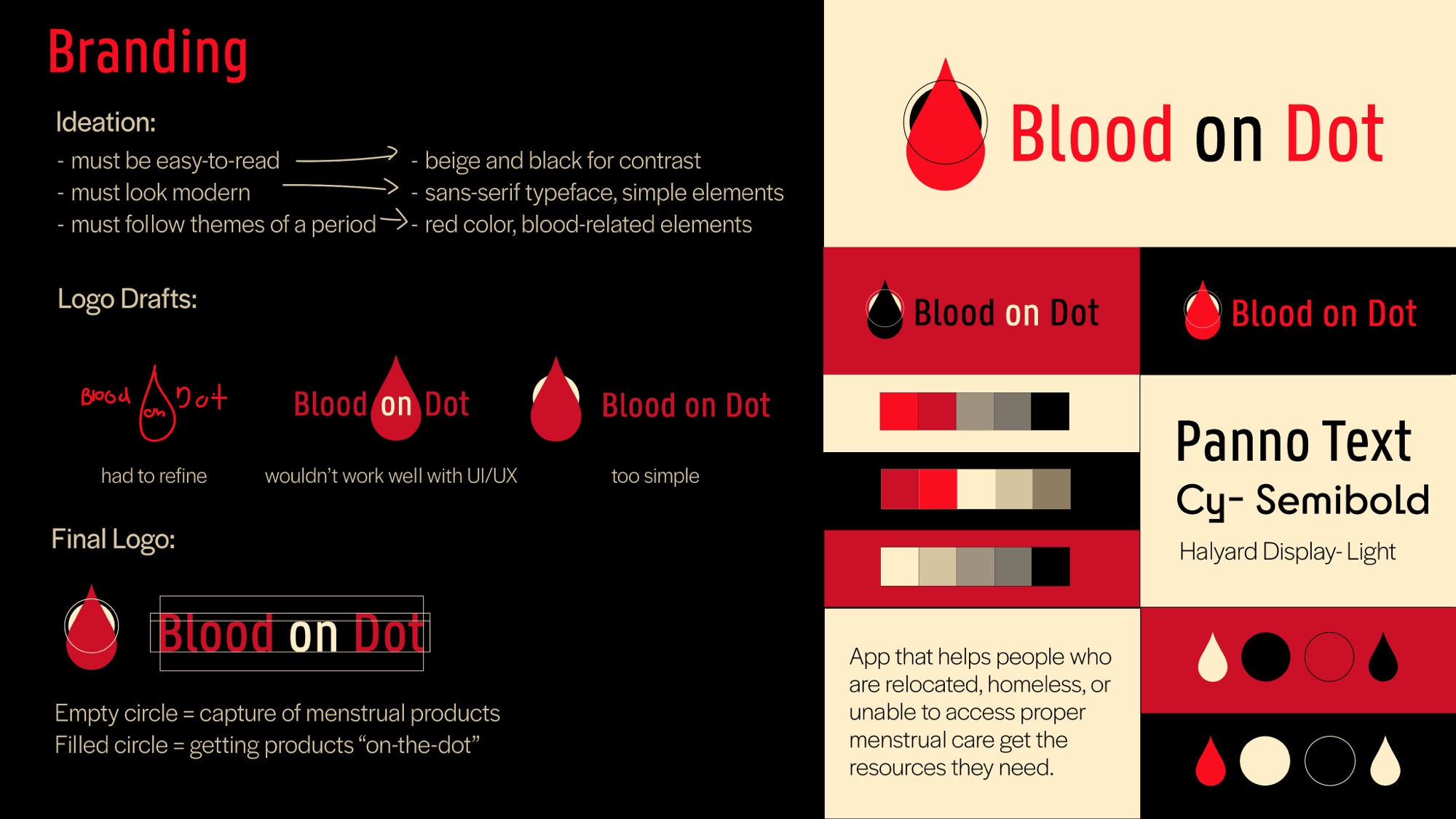
App that helps people who are relocated, homeless, or unable to access proper menstrual care get the resources they need.
Ideation
- must be easy-to-read → beige and black for contrast
- must look modern → sans-serif typeface, simple elements
- must follow themes of a period → red color, blood-related elements
Logo Drafts
- Draft 1 → had to refine
- Draft 2 → wouldn’t work well with UI/UX
- Draft 3 → too simple
Final Logo
- Empty circle = capture of menstrual products
- Filled circle = getting products “on-the-dot”
Typefaces
- Panno Text Cy – Semibold
- Halyard Display – Light
Ideation
While volunteering for a period poverty nonprofit, I noticed how decentralized their (and other nonprofit’s) events were to people who needed the resources the most. So I decided to create an open-source map where period poverty events were visible to people using the app.
Process
Features
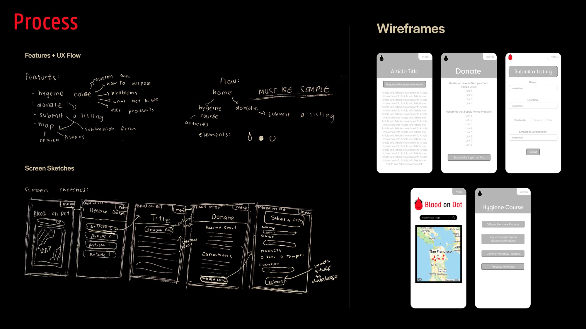
- hygiene course → how to dispose, problems, what not to use, different products, revision form
- donate → submit a listing
- submit a listing → submission form, map
- map → search, filters
Flow
- home → hygiene course → articles
- home → donate → submit a listing
- Must be simple
Elements
- the drop, the filled circle and the empty circle
User Testing
Once I had created a hi-fi prototype, I went to different period poverty nonprofits in Houston and asked them to use the app to make a listing for a period poverty event they were hosting. In addition, we had a flier asking for volunteers who have struggled with period poverty to help test looking for period poverty events on our app. The volunteers were given free period products during the user testing in partnership with the period poverty nonprofits we worked with. The overall response was that the map needed to be larger and that a Spanish translation of the app should be available (a feature we are working on).
Accessibility
3 Main Concerns
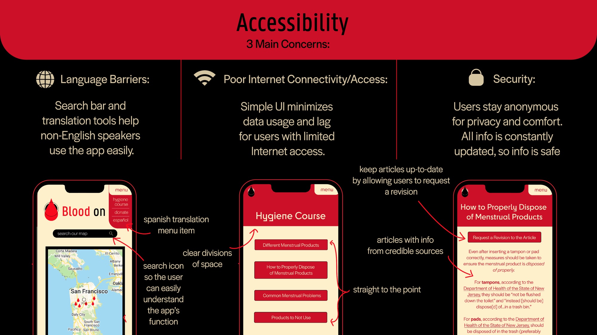
- Language Barriers: Search bar and translation tools help non-English speakers use the app easily.
- Poor Internet Connectivity/Access: Simple UI minimizes data usage and lag for users with limited Internet access.
- Security: Users stay anonymous for privacy and comfort. All info is constantly updated, so info is safe.
On the screens
- Spanish translation menu item
- search icon so the user can easily understand the app’s function
- clear divisions of space
- straight to the point
- articles with info from credible sources
- keep articles up-to-date by allowing users to request a revision
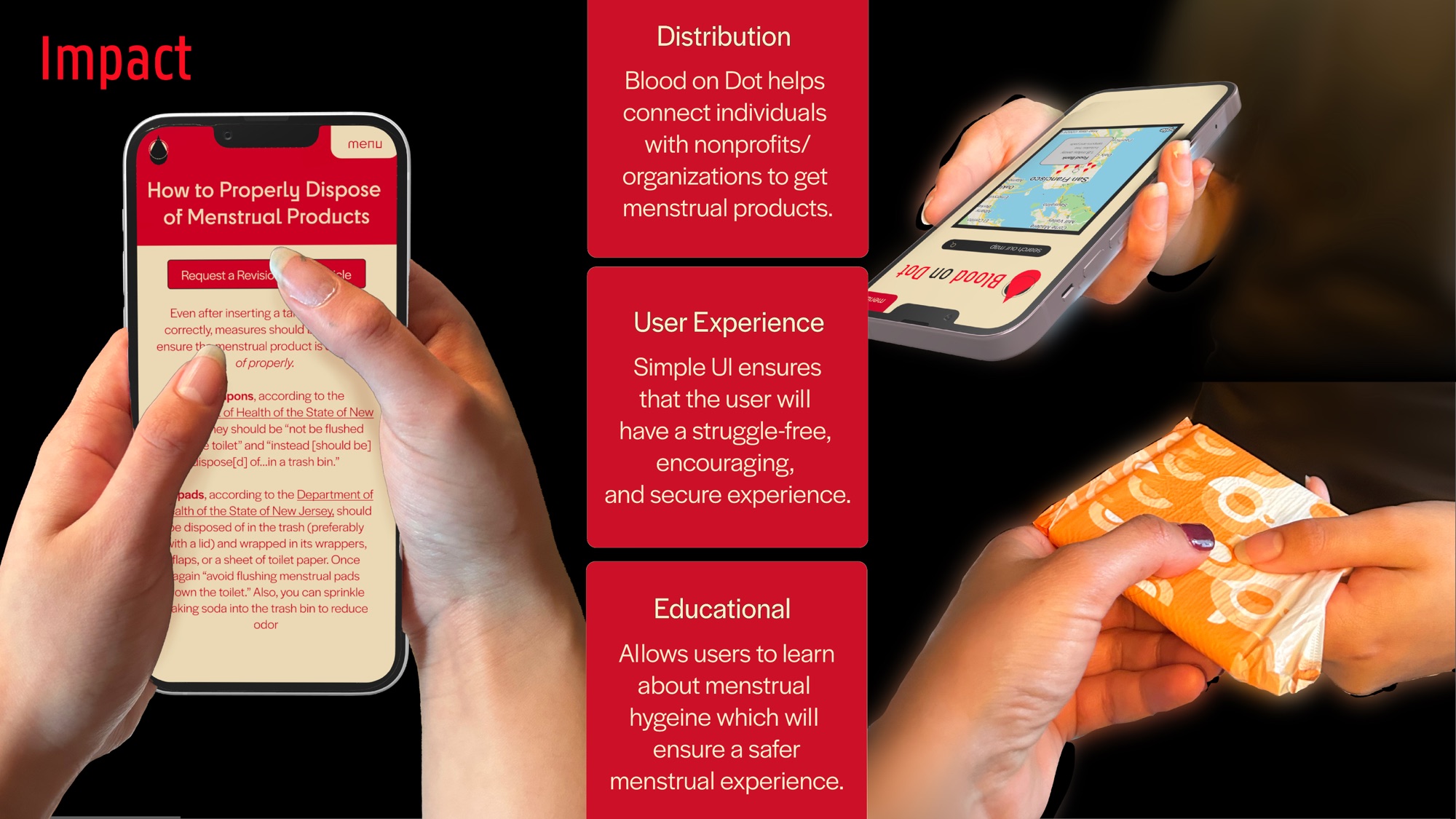
Impact
- Distribution: Blood on Dot helps connect individuals with nonprofits/organizations to get menstrual products.
- User Experience: Simple UI ensures that the user will have a struggle-free, encouraging, and secure experience.
- Educational: Allows users to learn about menstrual hygiene which will ensure a safer menstrual experience.
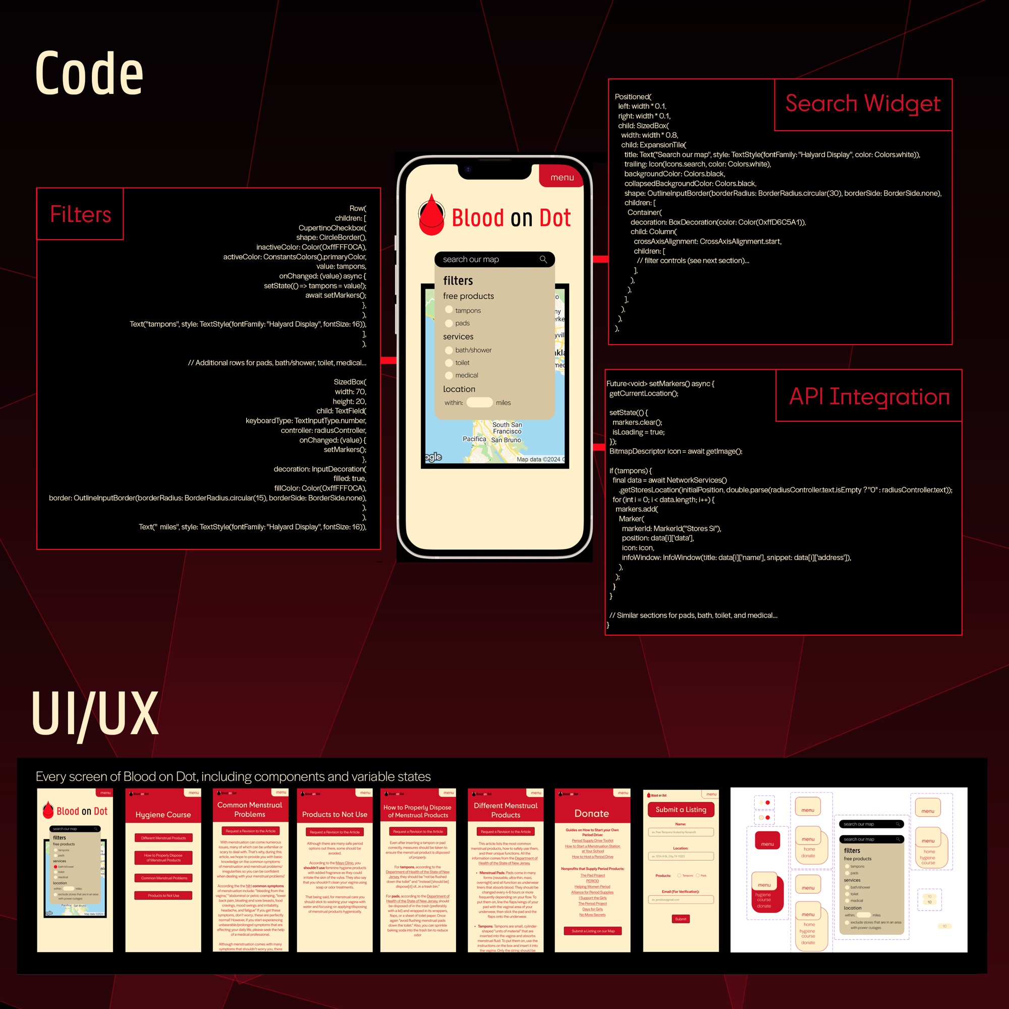
Code
Filters, Search Widget, API Integration
UI/UX
Every screen of Blood on Dot, including components and variable states.